Rebel Blogger Template

3 commentaires


Template Name : Rebel Blogger Template

Template Author : themelib

Designer : http://wpthemedesigner.com/

Basic Instructions : How to install a Blogger template

Descriptions : - 2 Columns, wp theme,Fixed ,Ads Ready,Fresh and clean Blogger template,, Gray color background,,Nice top menu bars,Top RSS,Search gadget ,Followers,Blogroll,Achieves,
Alternative text

Netdohoa Blogger Template

1 commentaires


Template Name : Netdohoa Blogger template

Template Author : netdohoa

Designer : http://www.netdohoa.com

Basic Instructions : How to install a Blogger template

Descriptions : - 2 Columns, Fixed ,wp theme,Ads Ready,Fresh and clean Blogger template,, Gray and white color background,,Nice top 2 menu bars,Search gadget ,Followers,Friends ,Categories, Blogroll,Achieves,
Alternative text

How to Add Bookmark Us Hyperlink to Blogger Blogs

1 commentaires


For your website to have traffic, people should remember your site and visit again. This problem was solved long time ago with browser's Bookmarks. Still, people are lazy and usually are not using it, unless you remind them. so you can add a quick "Bookmark this page" link in all your pages. Clicking on the link prompts the user with a dialog box to add the specified URL to the Favorites list.

Login To Blogger Go To > Design > Edit HTML.

and mark the tick box "Expand Widget Templates"

Then, find (CTRL+F) this code in the template.

</head>
And immediately before it, paste this code:
<script src='http://yourjavascript.com/0514111300/bookmark_this_page_royaltutor_net.js' style='text/javascript'/>
Now click Save Template.

Then, Go To > Design > Page Elements.

Simply add a Gadget of HTML/JavaScript type and add the code given below
<a href="javascript:bookmarksite('WEBSITE NAME GOES HERE', 'URL GOES HERE')">Bookmark This Site</a>
and to change the text to image / button , we should replace the word Bookmark This Site in the code with the following
<img src="URL-OF-BOOKMARK-BUTTON"/>
Finally save your template and you are done!
Alternative text

How to Change Feedburner Email Subject Line

4 commentaires


One of the best ways to build a loyal readership for your blog is to encourage visitors to subscribe via e-mail or RSS feed. FeedBurner is one of the most popular feed management solution that is available today for absolutely free of charge. Many bloggers use FeedBurner to manage their blog’s feed.

I noticed that the email subject line for my blog feed was always “Royal Tutor”. This does not give any information about what the email is about and the subscriber has to open the email before he can see the post title. Here’s how to tweak your FeedBurner settings so it will create dynamic Subject lines

1. Log in to your Feedburner account.
2. Click the name of the feed you want to update.
3. Click the “Publicize” tab.
4. Choose "Email Subscriptions" from the navigation menu 
5. That’ll open a sub-menu. Still in the left sidebar, click “Email Branding.”
6. Change what you want your subject line to be under the "Email Subject/Title" box.


If you update your blog more than once a day, click the box that says, “Change Subject when an email has 2 or more items” and use following codes:
Examples
  • To replace email subject line with your "last post title"
${lastestitemTitle}
  • To replace email subject line with your "last post title - blog name"
${latestItemTitle} - Your blog name
You can also use
Your Blog Name - “${latestItemTitle}” plus ${m} more
Your Blog Name (in this message: ${n} new items)

${n}: shows the total number of items
${m}: shows the number of items beyond the latest

So what are you waiting for?
Alternative text

Make Blogger Post Title Unclickable In Single Post Page

2 commentaires

 
If you want to make your blog post title unclickable in single post view then this tutorial is present for you. You might have notice that the titles of single post in this blog are unclickable.If not, view this post title. Then you see its unclickble. Now visit the homepage of this blog, then, look at any of the post titles. You can see the title is clickable and easily go inside the post by clicking the title of a post. So let’s do it,

Login To Blogger Go To > Design > Edit HTML.

and mark the tick box "Expand Widget Templates"

Then, find (CTRL+F) this code in the template.

<b:if cond='data:post.title'><h2 class='post-title entry-title'><b:if cond='data:post.link'><a expr:href='data:post.link'><data:post.title/></a><b:else/><b:if cond='data:post.url'><a expr:href='data:post.url'><data:post.title/></a><b:else/><data:post.title/></b:if></b:if></h2>
Please note that this code block not be similar in your template. I use H2 tag. But in your case it might be H1 or H3Now, replace the above code with the following:

<b:if cond='data:post.title'><h2 class='post-title entry-title'><b:if cond='data:blog.pageType == "item"'><b:if cond='data:post.link'><data:post.title/><b:else/><b:if cond='data:post.url'><data:post.title/><b:else/><data:post.title/></b:if></b:if>
<b:else/><b:if cond='data:post.link'><a expr:href='data:post.link'><data:post.title/></a><b:else/><b:if cond='data:post.url'><a expr:href='data:post.url'><data:post.title/></a><b:else/><data:post.title/></b:if></b:if></b:if></h2> 
 Now save the template and See how it work.

Alternative text

Collapsible Message Panels On Blogger

6 commentaires


collapsible-effect-blogger
When I was browsing a design blog called "impressivewebs", I found a header that could collapse itself. Impressed by the effect, I sat down to work out the logic and it was pretty simple to achieve it on blogger. In this article, I'll illustrate the collapsible effect with simple message panels while you may apply the same logic to your header or post area or to any widget of your choice.

COLLAPSIBLE MESSAGE PANELS ON BLOGGER - LIVE DEMO

So, take a look at the live demo by hitting the link above. I guess you liked it... Interested to add this on your blog, as well? Then, follow the steps below.
1. Navigate to "Design>>Edit HTML" and make a backup of your template by clicking on the "Download full template" link at the top of the page. Once the back up is over, search for the following piece of code.


]]></b:skin>
2. Just paste the following piece of code above the line mentioned at step 1.
.message_list {
    list-style: none;
    margin: 0;
    padding: 0;
    width: 383px;
}
.message_list li {
    padding: 0;
    margin: 0;
    background: url(https://lh5.googleusercontent.com/-rFKQUJCuaBU/TkdtUFeNzGI/AAAAAAAABec/bn_KIzqh03c/s800/message-bar.png) no-repeat;
}
.message_head {
    padding: 5px 10px;
    cursor: pointer;
    position: relative;
}
.message_head .timestamp {
    color: #666666;
    font-size: 95%;
    position: absolute;
    right: 10px;
    top: 5px;
}
.message_head cite {
    font-size: 100%;
    font-weight: bold;
    font-style: normal;
}
.message_body {
    padding: 5px 10px 15px;
}
.collapse_buttons {
    text-align: right;
    border-top: solid 1px #e4e4e4;
    padding: 5px 0;
    width: 383px;
}
.collapse_buttons a {
    margin-left: 15px;
    float: right;
}
.show_all_message {
    background: url(https://lh3.googleusercontent.com/-SYzKGAtmZa8/TkdtUMVjh4I/AAAAAAAABeY/VXlnQnXlEQ4/s800/tall-down-arrow.png) no-repeat right center;
    padding-right: 12px;
}
.show_recent_only {
    display: none;
    background: url(https://lh6.googleusercontent.com/--99zjaBlqYY/TkdtURvdWRI/AAAAAAAABeg/Z8Yismgt5YY/s800/tall-up-arrow.png) no-repeat right center;
    padding-right: 12px;
}
.collpase_all_message {
    background: url(https://lh4.googleusercontent.com/-_mvlatWt3m4/TkdtUCz8LII/AAAAAAAABeU/mctqJi0fkbs/s800/collapse-all.png) no-repeat right center;
    padding-right: 12px;
    color: #666666;
}
Note: I've used an image for the title part of the image. You may replace the same with gradient colors using CSS. Refer the following article to do the same - Cross-Browser Gradient Effect Using CSS
3. Next, search for the following piece of code.
</head>
4. Paste the following piece of code just above the line mentioned in step 3. Save your template.
<script src='http://ajax.googleapis.com/ajax/libs/jquery/1.6.2/jquery.min.js' type='text/javascript'/>
<script type='text/javascript'>
$(document).ready(function(){
    //hide message_body after the first one
    $(&quot;.message_list .message_body:gt(0)&quot;).hide();
    //hide message li after the 5th
    $(&quot;.message_list li:gt(4)&quot;).hide();  
    //toggle message_body
    $(&quot;.message_head&quot;).click(function(){
        $(this).next(&quot;.message_body&quot;).slideToggle(500)
        return false;
    });
    //collapse all messages
    $(&quot;.collpase_all_message&quot;).click(function(){
        $(&quot;.message_body&quot;).slideUp(500)
        return false;
    });
    //show all messages
    $(&quot;.show_all_message&quot;).click(function(){
        $(this).hide()
        $(&quot;.show_recent_only&quot;).show()
        $(&quot;.message_list li:gt(4)&quot;).slideDown()
        return false;
    });
    //show recent messages only
    $(&quot;.show_recent_only&quot;).click(function(){
        $(this).hide()
        $(&quot;.show_all_message&quot;).show()
        $(&quot;.message_list li:gt(4)&quot;).slideUp()
        return false;
    });
});
</script>
Note: Do not include the first line in the script mentioned above if you've already added the latest jquery file on your blog. 
5. Now, paste the following piece of code in the document - HTML FOR COLLAPSIBLE EFFECT, anywhere inbetween your <body> and </body> tags - probably within the post editor (or) below <div class='main-wrapper'> (or) <div class='columns fauxcolumns'>.
6. That's it! Save your template or publish the article and view the same to enjoy the effect.

HTML CUSTOMIZATION - FOR CODE MENTIONED IN STEP 5
If you wish to generate the time for your messages (displayed at the top right) by default, then change the text that appears in between  <span class="timestamp"> and  </span> tags. Similarly, you can change the text from "NAME" and "CLIENT" with your names and clients respectively. I've added my name and a small message in the first few div tags for reference. Check the same (code mentioned in text document at step 5) for your reference.

I've tested the above effect on all the major browsers which includes, but not limited to, IE, FF, Chrome, Safari and Opera. Let me know if you find some bugs with the above coding. If you need assistance in extending this effect to other elements on your blog, then leave a comment below and I'll help you out when I'm free:) Do share your opinions about the article via comments!


Alternative text

Google Sitelinks Updated - An Improved Version

1 commentaires


google-sitelinks
Google has constantly been rolling out some prominent changes via updates on PR, Google+ Games, Authorship Markups, etc... Today, I noticed one such update which is about, the way in which the sitelinks show up on Google search. If you wonder what sitelinks are, they are basically links from your blog that appear below your domain name which Google feels useful to the reader - usually appears when a person searches for your domain name.

Earlier, Google used to display eight sitelinks - just links. But, now it's completely different. The recent update shows 12 sitelinks with a small snippet about your articles - not a snippet, probably the first phrase from your article. You may check out the screen shot below to better understand about the way in which the new sitelinks are displayed - sitelinks generated for "newbloggingtipz" on 19th August.

Since sitelinks are auto generated by Google with their special algorithms specifically written for the same, no one can actually tell you about getting sitelinks for your blog. However, I recommend you to read the following article which might probably fetch you one - How To Get Google Sitelinks For Your Blog? I also recommend you to install breadcrumbs for better results - Add Breadcrumb Navigation To Blogger.

Now, what if your unhappy with a link that appears below your domain name and you wish to remove the same. Very Simple! Login to your "Webmaster Tools" account and navigate to "Site Configuration>>Sitelinks" from your dashboard. Now, paste the URL you wish to remove and hit the "Demote" tab. That's it! Your done. 

You'll not see that link from the next day - takes time to process your request. As such, you can demote upto 100 URLs and they are effective only for 90 days which means they might pop up again after a period of 90 days. So, you need to demote them every 90 days. You can read more about this topic here - Sitelinks.

Let me know if you made use of the demote/deletion tool to display better links to your readers? And do share your knowledge about Sitelinks with us via comments...
Alternative text

New Share Button With Counters On Blogger

0 commentaires


I'm sure you would have noticed the recent addition of share counters at the end of the article on my post pages. My friend, Paul Crowe from "Spice Up Your Blog", had posted a video tutorial about the same which you may check out on his blog. So, if you wish to have this new share counter on your blog, then just follow the steps in the tutorial given below.

What non-sense is he talking about? Is that the question that's running on your mind? Well, then have a look at the following picture to get a better idea about what I'm talking.
New-Share-Counters-For-Blogger
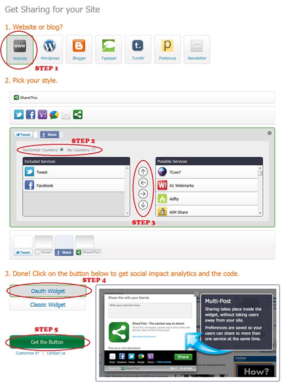
Before we start the actual tutorial, let's first get the scripts which make the share counters appear. Go the following link : Sharethis. Register with them and hit the "Publishers>>Get the Share Widget" tab. Select the following options on the page that appears.
1. Website or Blog? Choose website.
2. Pick your style - Third Option (Horizontal counters)
3. From the various networking sites, choose the ones which you want to have on your blog. Just use the left and right arrows to add and remove the various counters. The up and down arrows aligns your counters - which one should appear first in your list. It's pretty self-explanatory.
4. Choose the Oauth widget or Classic Widget.
5. Now, hit the "Get the button" tab and copy the scripts that are generated to two separate text documents temporarily and name them Script 1 (Script in the top/first box) and Script 2 (Script in the bottom/second box). 
share-button-tutorial
Now, you have the scripts with you. You need to place them on your blogger template with some CSS to make it more attractive. So, let's get it done!!!
1. Navigate to "Design>>Edit HTML" and make a backup of your template by clicking on the "Download full template" link at the top of the page. Once the back up is over, search for the following piece of code.
]]></b:skin>
2. Add the following code (CSS) just above the line mentioned in step 1.
.sharethis {
border: dashed #ddd;
border-width:1px 0 1px 0;
margin: 10px auto 10px;
display:block;
padding: 3px 0 1px 0px;
overflow: hidden;
margin-left:0px;
}
3. Next, search for the following piece of code.
</head>
4. Place the coding present in the text document Script 2, just above the line mentioned in step 3.
5. Save your template. Then, expand your template and search for the following piece of code.
<div class='post-footer-line post-footer-line-1'/>
6. Add the following piece of code just below the line mentioned in step 5.
<b:if cond='data:blog.pageType == "item"'>
<span style='font-size:20px; font-family:Georgia; font-style: italic; line-height:21px; margin-top:1px; margin-bottom:-2px;'>Enjoyed the article?</span>
<div class='social'>
<div style='margin-left:10px; margin-top:0px; margin-bottom:3px;'>
YOUR SHARE THIS CODE FROM SCRIPT 1
</div>
</div>
<div class='clear'/>
</b:if>
7. Replace the line highlighted in green with the coding present in the text documentScript 1.
8. That's it! Save your template. 

Note: The counters will be visible only on post pages. If you wish to have them on all the pages, then remove the first and the last line in the coding mentioned at step 6.

I would like to point out one advantage with this counter which is better loading time. That is, you get all the counters at one place. So, it saves a lot of time in loading your scripts. Hope you enjoyed this post. Share your opinions about the counter/post via comments!
Alternative text

Subscription Box Using Tooltip For Blogger

0 commentaires


In my previous article about HTML Tooltip, I mentioned about "callingallgeeks.org". If you missed the article, then check out - Tooltip For Blogger Using jQuery & CSS. Harsh on his blog "callingallgeeks.org" used this effect to display the Tooltip over the share icons - RSS, Twitter, Facebook. You may experience the Tooltip effect on Yahoo! Cricket too - hover your mouse over the player names.
Subscribe-Tooltip-Demo
In this article, I'll just share the code which will create the Tooltip effect when you hover your mouse over the subscribe icons. If you need the code for the entire subscription box, well install the widget that appears on this article first - Tutorial to add the subscription box. Later, use the code that appears in this post to realize a proper subscription box. So, let's get started.

1. Navigate to "Design >> Edit HTML" and make a backup of your template by clicking on the "Download full template" link at the top of the page. Once the back up is over, search for the following piece of code.
]]></b:skin>
2. Paste the following piece of code just above the line mentioned in step 1.
#dhtmltooltip {
background-color: #484848;
background-image: url("https://lh4.googleusercontent.com/-5SQOgS6ij1A/TiE0rmXU9gI/AAAAAAAABUQ/KwaaLmoeP4c/s800/mouse-hover-bg.png");
background-repeat: repeat-x;
border: 1px solid #AAAAAA;
color: #F2F2F2;
font-size: 12px;
font-weight: bold;
height: 27px;
line-height: 20px;
padding: 10px 20px;
position: absolute;
text-align: center;
z-index: 100;
visibility:hidden;
}
#dhtmlpointer{
position: absolute;
z-index: 101;
visibility:hidden;
}
.social-subscribe ul {
list-style: none outside none;
}
.social-subscribe li {
float: left;
}
.social-subscribe li a.rss {
background: url("https://lh3.googleusercontent.com/-HTQ6s6GmBLg/TiE0rFVVQsI/AAAAAAAABUI/pWdIwOUEuA8/s800/icon-rss.gif") no-repeat scroll 0 0 transparent;
padding: 0 2px 0 0;
}
.social-subscribe li a {
display: inline-block;
height: 52px;
width: 57px;
}
.social-subscribe li a.facebook {
background: url("https://lh6.googleusercontent.com/-tkdaWLGbFQI/TiE0rPLM1QI/AAAAAAAABUE/DG4wcOs1xwY/s800/icon-facebook.gif") no-repeat scroll 0 0 transparent;
padding: 0 2px 0 0;
}
.social-subscribe li a {
display: inline-block;
height: 52px;
width: 57px;
}
.social-subscribe li a.twitter {
background: url("https://lh4.googleusercontent.com/-bIK53VccMss/TiE0ra0pGKI/AAAAAAAABUM/NewFfwHhH7U/s800/icon-twitter.gif") no-repeat scroll 0 0 transparent;
padding: 0 2px 0 0;
}
.social-subscribe li a {
display: inline-block;
height: 52px;
width: 57px;
}
3. Save your template and navigate to "Design >> Page Elements >> Add a Gadget" and choose "HTML/Javascript".
4. Download the following text document - HTML FOR TOOLTIP EFFECT ON SUBSCRIBE ICONS. Just copy the code present in the text document and paste it on the window that pops up. Make the following customizations before you save the widget.
  1. Replace FEEDNAME with the name of your feed obtained from FeedBuner. Your feed name is nothing but your feed title. So, open your FeedBurner account and check out the Feed details. There are two instances where you need to replace FEEDNAME with your feed name.
  2. Replace TWITTER-USERNAME with your twitter user name. There are two instances where you need to replace the same.
  3. Replace FAN-PAGE-URL with your facebook fan page URL. Similar to the previous two customizations, this replacement should also be made at two instances.
5. Once the above customizations are made, just save the widget and your done!

In case you find the customization part a bit difficult to understand, then take a look at the example coding which I used on my demo blog by downloading this text document -SAMPLE CODE. This effect was tested on all major browsers - Firefox, IE, Safari, Chrome, Opera. If you have some unique ideas to illustrate this same effect in a different manner, then share it via comments! Would love to hear from the CSS and Jquery geeks out there!
Alternative text

Cool Image Hover Effect On Blogger - Popout Details

0 commentaires


I recently came across a cool image hover effect on a WordPress blog which made me to work out the codes for achieving a similar effect on blogger. The idea behind this effect is to display a short snippet/detail about the image on hover using only CSS. Many had already seen the demo on my test blog while those who did not, just take a look at the live demo by visiting the link below.

POPOUT DETAILS EFFECT ON BLOGGER - LIVE DEMO

Cool... Isn't it? Just follow the instructions given below to get a similar effect on your blog as well. Just create a back up in case something goes wrong. To do so, navigate to "Design>>Edit HTML" and click on the "Download full template" link at the top of the page. That's it!

1. Once the back up is over, paste the following piece of code anywhere between the 'body' tags on your template - probably below <div id='content-wrapper'> (or) <div class='columns fauxcolumns'>.
<ul class="columns">
 <li>
  <a href="#"><img src="IMAGE URL" /></a>
    <div class="info">
      <h2>TITLE</h2>
      <p>DESCRIPTION</p>
    </div>
 </li>
</ul>
2. Replace '#' with the link you wish to point to and 'IMAGE URL' with the URL of your image, probably with the following dimensions - 220x200px. Similarly, replace 'TITLE' and "DESCRIPTION' with the title and description you wish to have on hover, respectively. Repeat the codes within 'ul' tags for adding multiple images.
You may download the reference code, which I used on the demo site, here - Reference.
3. Let's style the above HTML with some CSS. To do so, search for the following code on your template.
]]></b:skin>
4. Paste the following piece of code just above the line mentioned in step 3.
ul.columns {
width: 480px;
list-style: none;
padding:0px;
margin-left:10px;
}
ul.columns li {
width: 220px;
float: left; display: inline;
margin-top:15px;
margin-left:7px;
margin-right:7px;
margin-bottom:7px; padding: 0;
position: relative;
}
ul.columns li:hover {z-index: 99;}
ul.columns li img {
position: relative;
filter: alpha(opacity=30);
opacity: 0.3;
-ms-filter:"progid:DXImageTransform.Microsoft.Alpha(Opacity=30)";
}
ul.columns li:hover img{
z-index: 999;
filter: alpha(opacity=100);
opacity: 1;
-ms-filter: "progid:DXImageTransform.Microsoft.Alpha(Opacity=100)";
}
ul.columns li .info {
position: absolute;
left: -10px; top: -10px;
padding: 210px 10px 20px;
width: 220px;
display: none;
background: #fff;
font-size: 1.2em;
-webkit-border-radius: 3px;
-moz-border-radius: 3px;
border-radius: 3px;
font-family:Georgia,"Times New Roman",Times,serif;
text-align:justify;
}
ul.columns li:hover .info {display: block;}
ul.columns li h2 {
font-size: 1.2em;
font-weight: normal;
text-transform: uppercase;
margin: 0; padding: 10px 0;
font-family:Georgia,"Times New Roman",Times,serif;
}
ul.columns li p {padding: 0; margin: 0; font-size: 0.9em;}
5. You need not modify anything the codes above except for the margin positions to best fit your blog. That's it! Save your template and take a look at the cool effect on your blog.

The above effect worked successfully on the major browsers which includes, but not limited to, IE, Firefox, Chrome, Opera and Safari. So, give them a shot on your blog and let us know whether you enjoyed this cool effect via comments! See you soon with another interesting tutorial. You may check out the other image hover effect here -Shadow Effect.
Inspiration for the above article - Sohtanaka.
Alternative text

Collapsible Message Panel Demo

3 commentaires


I've been constantly trying to pull out unique articles for blogs run on blogger. I'm sure you would have noticed the same provided you are a constant follower of my blog. So, we've yet another interesting article based on jQuery, called the "Shutter Effect for the Images On Blogger", inspired from tutorialzine. Just take a look at the live demo of the effect by hitting the link below and we'll get started...

SHUTTER EFFECT ON BLOGGER - LIVE DEMO
Interesting effect... Isn't it? I would suggest the above effect for blogs based on photography. While, webmasters and web designers can use the above effect to showcase their portfolios. I'm sure there are lots more places wherein you can use the above effect. So, I'm open to your suggestions... Well, let's get started with the tutorial.

JAVASCRIPT/JQUERY
1. Navigate to "Design>>Edit HTML" and click on the "Download full template" link at the top of the page. Once the back up is over, search for the following code in your template.
</head>
2. Paste the code present in the following text document - Jquery For Shutter Effect, just above the line mentioned in step 1.
3. That's it! Save your template temporarily.

HTML
1. Look out for any one of the following codes in your template.
<div id='content-wrapper'>
(or)
<div class='columns fauxcolumns'>
(or)
<div id='main-wrapper'>
2. Paste the following code just below the code, you searched for, in step 3.
<div id='container' style='position: relative;'>
<ul>
<li style='display: none;'>
<img height='450' src='IMAGE URL' width='600'/>
</li>
<li style='display: none;'>
<img height='450' src='IMAGE URL' width='600'/>
</li>
<li style='display: list-item;'>
<img height='450' src='IMAGE URL' width='600'/>
</li>
<li style='display: list-item;'>
<img height='450' src='IMAGE URL' width='600'/>
</li>
</ul>
<div class='shutterAnimationHolder' style='width: 600px; height: 450px; display: none;'>
<div class='film' style='height: 15000px; width: 1000px; margin-left: -500px; top: -300px;'>
<canvas height='1000' width='1000'/><canvas height='1000' width='1000'/><canvas height='1000' width='1000'/><canvas height='1000' width='1000'/><canvas height='1000' width='1000'/><canvas height='1000' width='1000'/><canvas height='1000' width='1000'/><canvas height='1000' width='1000'/><canvas height='1000' width='1000'/><canvas height='1000' width='1000'/><canvas height='1000' width='1000'/><canvas height='1000' width='1000'/><canvas height='1000' width='1000'/><canvas height='1000' width='1000'/><canvas height='1000' width='1000'/>
</div>
</div>
</div>
(Note: It is not necessary that you place the above code below those lines mentioned in step 3. You can place them anywhere in your template. If you end up with some layout issues or bugs, then leave a comment below.)
3. Replace "IMAGE URL" with the URL of your images - image dimensions shall be 600x450px. Save your template again.
4. If you wish to change the width and height of the images (600x450px), then you need to change the codes highlighted in blue mentioned at step 2.

CSS
1. Search for the following code in your template. 
]]></b:skin>
2. Add the following piece of code just above the line mentioned in step 1.
#container{
    width:600px;
    height:450px;
    margin:0 auto;
    border:5px solid #fff;
    overflow:hidden;
    -moz-box-shadow: 0 0 10px rgba(0, 0, 0, 0.3);
    -webkit-box-shadow: 0 0 10px rgba(0, 0, 0, 0.3);
    box-shadow: 0 0 10px rgba(0, 0, 0, 0.3);
    margin-bottom:5px;
}

#container ul{
    list-style:none;
    margin-top:0px;
}
.shutterAnimationHolder .film canvas{
    display: block;
    margin: 0 auto;
}
.shutterAnimationHolder .film{
    position:absolute;
    left:50%;
    top:0;
}
.shutterAnimationHolder{
    position:absolute;
    overflow:hidden;
    top:0;
    left:0;
    z-index:1000;
}
3. Save your template and we're done. 
Just in case you customized the image or in other words, followed the step 4 in HTML part, then change the codes highlighted in green mentioned at step 2. If not, just neglect this step and check out the stunning effect on your blog.

The above effect was tested to work perfectly fine on all the major browsers that include, not limited to, FF, Chrome, Opera and Safari. If you find the HTML part difficult to customize, then you may refer to the following text document for the coding that I used on the demo blog - Reference for Shutter Effect. Share your opinions via comments!


Alternative text


Sponsors

Protected by Copyscape Web Copyright Protection

All For Blogs. Copyright 2011 All Rights Reserved powered by Revolution Church Theme hosted on Blogger